Color Theory and Choosing the Right Paint Color: A Guide by Carfagno Professional Painting
Introduction To Colors In Painting
Color is not merely an aesthetic choice when it comes to interior design – it’s a potent tool that can transform rooms, define spaces, and create mood. At Carfagno Professional Painting, we understand the power of color. With years of expertise in the painting industry, we’ve mastered the art of using color to bring spaces to life.
Diving Into Color Theory
Color theory is a fascinating intersection of science and art. It’s a concept that dates back to Sir Isaac Newton’s discovery of the color spectrum and his development of the color wheel. This theory involves understanding the relationships and interactions between colors in a way that brings harmony and balance to a design.
The Color Wheel
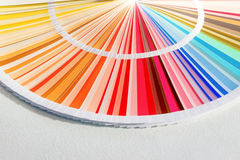
The color wheel is a basic yet powerful tool in color theory. It comprises:
- Primary Colors: Red, blue, and yellow. These are the mother colors that cannot be created through any combination of other colors.
- Secondary Colors: Green, orange, and purple. These are derived by mixing two primary colors.
- Tertiary Colors: These are the offspring of a primary color and a secondary color.
Understanding these color classifications forms the basis of creating color schemes for your painting project.
Color Harmony
When colors work well together, they create a pleasing arrangement known as color harmony. There are several ways to achieve this:
- Analogous Colors: These are colors that sit next to each other on the color wheel. They tend to have a harmonious relationship because they share common base colors.
- Complementary Colors: These are colors directly opposite each other on the color wheel. When used together, they create a vibrant contrast.
- Triadic and Tetradic Schemes: These involve using three or four colors that are evenly spaced around the color wheel. They offer a balanced yet vibrant color palette.
The Psychology of Colors
Color is not just about visual appeal – it has profound psychological effects. It can evoke emotions and influence mood, making it a crucial design element.
Colors and Emotions
- Warm Colors vs. Cool Colors: Warm colors like red, orange, and yellow often evoke feelings of happiness, optimism, and energy, while cool colors like blue, green, and purple exude calmness, relaxation, and serenity.
- The Influence of Specific Colors: Each color has unique emotional effects. For example, red is known for its energizing and stimulating effect, while blue is associated with tranquility and stability.

Color Context Matters
Apart from the emotional responses that colors can evoke, it’s also important to consider two other factors when choosing colors: cultural associations and functional considerations. These aspects of color theory can significantly influence how a color is perceived and how it affects the functionality of a space.
- Cultural Associations: Colors can have diverse meanings in different cultures. For instance, white represents purity in many Western cultures but can symbolize mourning in some Eastern cultures.
- Functional Considerations: Colors can enhance or inhibit certain activities. Red, known to stimulate appetite, is a popular choice for dining rooms, while soothing green or blue hues may be ideal for bedrooms.
Practical Applications in Painting Your Home or Business
Start with the Space
The first step in applying color theory to your painting project is to carefully evaluate the space you’ll be working with. What is the purpose of this space? Is it a restful bedroom, a productive home office, or a lively kitchen? The function of the room can help guide your color choices.
For example, a calming blue might be suitable for a bedroom, while a vibrant yellow might be perfect for a kitchen.
Consider Lighting
Lighting plays a crucial role in how colors appear. Under different light sources – natural daylight, incandescent bulbs, LED lights – the same color can look drastically different. Similarly, colors can change throughout the day as the quality of natural light changes.
To avoid any surprises, always check your color choices in the actual space and under the lighting conditions where they will be used. You can do this by painting a small swatch on the wall and observing how it looks at different times of the day and under different lighting conditions. This will help ensure that the color you choose will look as you expect it to in your space, no matter the lighting.
Color Tips from Carfagno Professional Painting
Whether you’re a novice or an experienced painter, here’s some valuable tips to consider. These expert recommendations can help ensure that your painting project is successful and the final result is just as you envisioned. From selecting the right color palette to understanding how lighting affects your color choices, these tips are designed to guide you through the painting process and help you make the most of color theory in your painting project.
Test Patches Matter
Test patches are a critical step in the painting process, and here’s why they matter: Paint colors can often look different on a swatch or in the can than they do on your wall. This is due to a variety of factors, including the texture of your walls, the lighting in your space, and the surrounding colors. By applying a test patch, you get a more accurate preview of how the color will look in your specific environment.
To effectively use test patches, follow these steps:
Choose a small section of your wall that is representative of the overall space. Apply the paint color you’re considering, being sure to cover enough area for a clear evaluation – a 1×1 foot square is usually sufficient. Then, observe the painted patch at different times of the day and under different lighting conditions.
How does it look in the morning light compared to the evening? Does the color change drastically under artificial lighting? Observing the test patch in this way will give you a well-rounded understanding of how the paint color will perform in your space, helping you make an informed decision.
You might also consider painting test patches of a few different colors to compare and contrast the effects. Remember, it’s better to spend a little extra time testing now than to end up with a color you’re not happy with later on.
Balance Trends with Timelessness
While staying on trend with the latest color palettes can give your space a contemporary feel, it’s also vital to consider longevity in your color choices. Trends can come and go rapidly, but the paint on your walls is something you’ll likely live with for several years. Therefore, it’s crucial to select colors that not only reflect current styles but also align with your personal taste and the overall aesthetic of your home.
First, think about what colors make you feel comfortable and happy. Do you gravitate towards calming blues, invigorating greens, or perhaps warm, earthy tones? Your home should be a place where you feel at ease, so choose colors that contribute to that feeling.
Then, consider the architectural style and existing decor of your home. Some colors may suit a modern, minimalist home but look out of place in a traditional, ornate setting. Try to choose colors that harmonize with the other elements of your space.
Lastly, don’t be afraid to experiment and express your unique style. While it’s helpful to take inspiration from trends, remember that your home is an extension of your personality. If you love a particular color that isn’t currently trending, don’t hesitate to use it. After all, the most important thing is that you love the space you’re in.
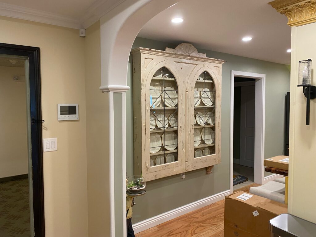
Work with Neutrals and Accents
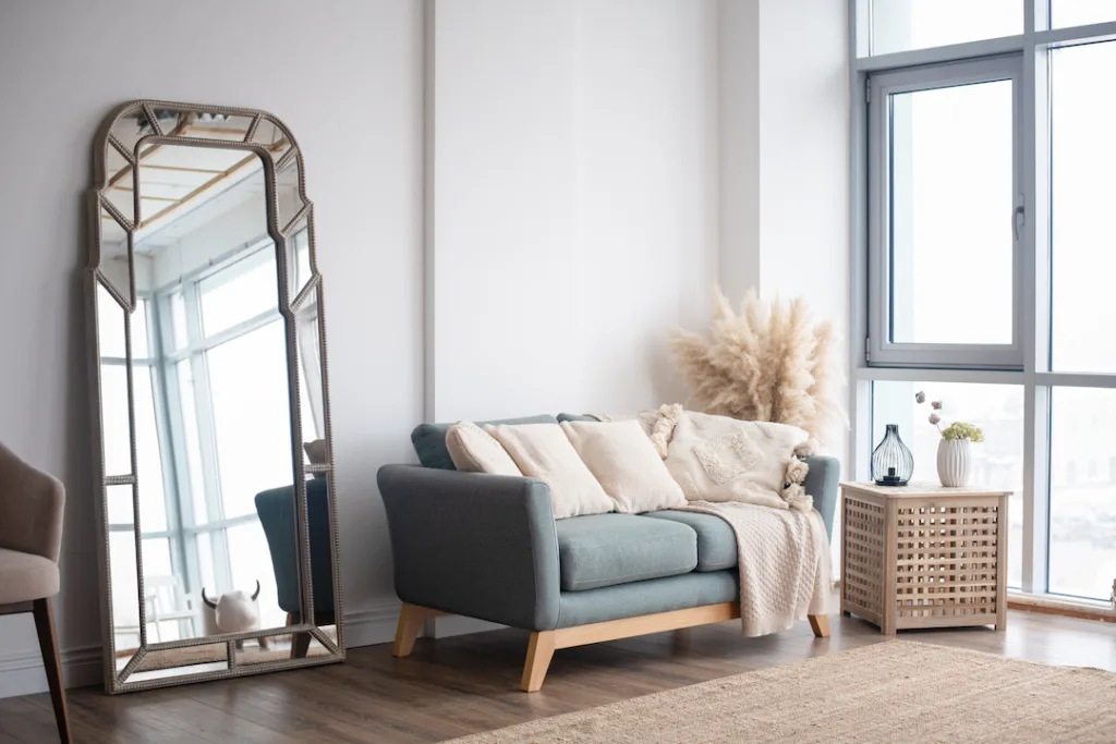
Neutrals, such as shades of white, gray, beige, or taupe, provide a versatile backdrop that can complement virtually any style or decor. They are timeless, easy on the eyes, and have a knack for making a space feel larger and more open. Neutrals also offer flexibility, allowing you to change up your decor or accent colors without needing to repaint your walls.
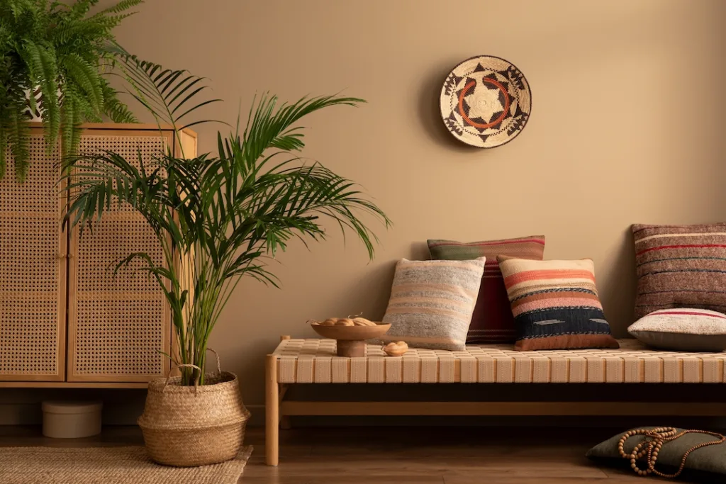
While neutrals create a soothing and cohesive base, accent colors are what add character, interest, and depth to your space. They can be bold, vibrant hues that create a focal point, or softer tones that subtly draw attention to specific features or areas in the room. Accent colors can be introduced through painting an accent wall, or by using them in textiles, artwork, furniture, or decor accessories.
The key to successfully working with neutrals and accents is balance. Too many neutral tones can make a room feel bland, while too many bold accent colors can overwhelm the space and make it feel chaotic. A good rule of thumb is to follow the 60-30-10 rule: 60% of the room should be a dominant, neutral color, 30% a secondary color or texture, and the last 10% an accent color.
The Goal: Achieving Your Desired Effects with Paint Colors
The strategic use of paint color can significantly influence the perception and mood of a room.
Make The Room Grow
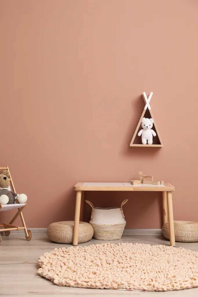
If you’re looking to make a small room appear more spacious, opting for lighter shades is generally a good choice. Pale hues, such as off-white, cream, or pastel tones, have the ability to reflect light, which can make a room feel brighter and more open. This optical illusion of space can transform a cramped area into one that feels airy and expansive.
A Cozy Nook
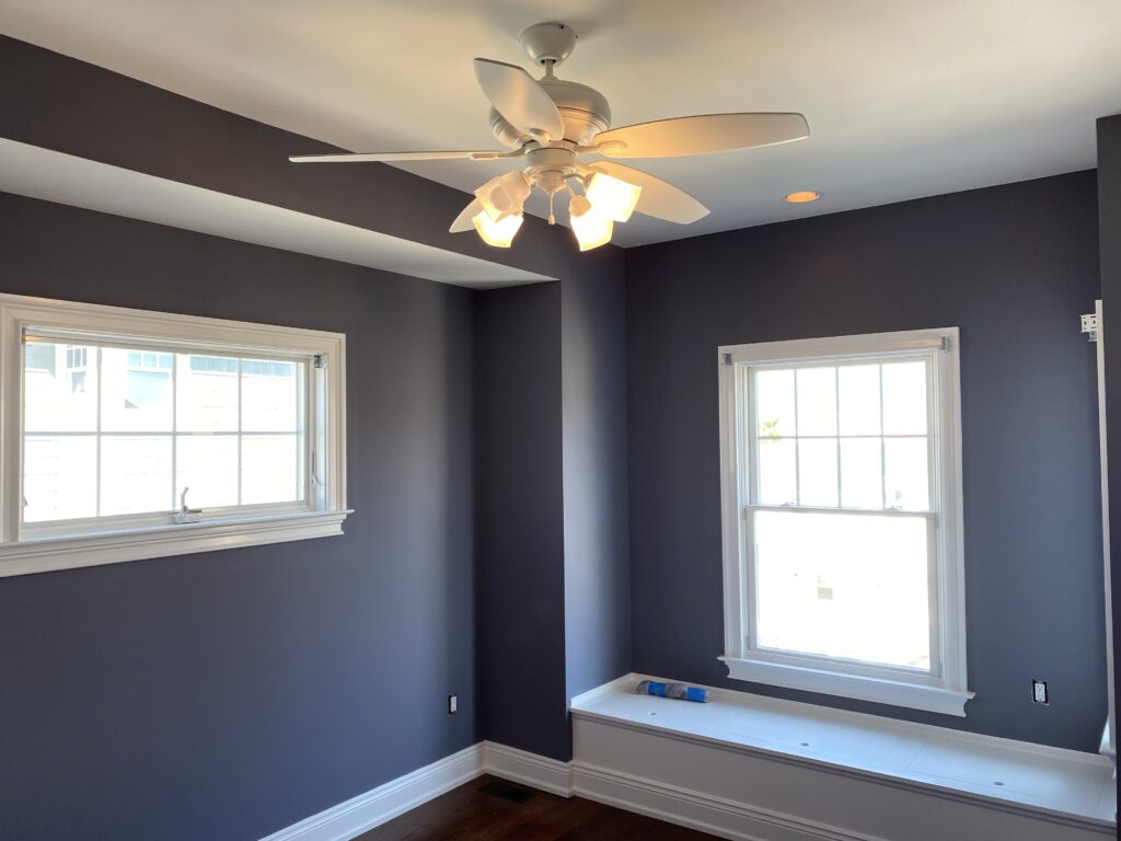
On the other hand, if your aim is to create a cozy, intimate atmosphere, darker colors can be your ally. Rich, deep tones, like navy, burgundy, or chocolate brown, tend to absorb light, reducing the perceived size of a room. This can make large, open spaces feel more snug and inviting. Similarly, vibrant colors can energize a room, making it feel lively and dynamic.
We Hope This Helps!
Trust Carfago Professional Painting
If you're ready to transform your space with color, don't hesitate to reach out to Carfagno Professional Painting for a consultation. We're eager to hear about your personal color selection stories or challenges. Embark on your journey to a beautifully colored space by visiting our website or calling us at (609) 224-0235. Let us help bring your unique vision to life.
Understanding color theory can significantly enhance your ability to make the best paint choices for your living or workspace. It’s a skill that can elevate the atmosphere, mood, and overall aesthetic of your space. However, while personal experimentation can lead to beautiful results, professional guidance can simplify this process and ensure a more effective outcome.